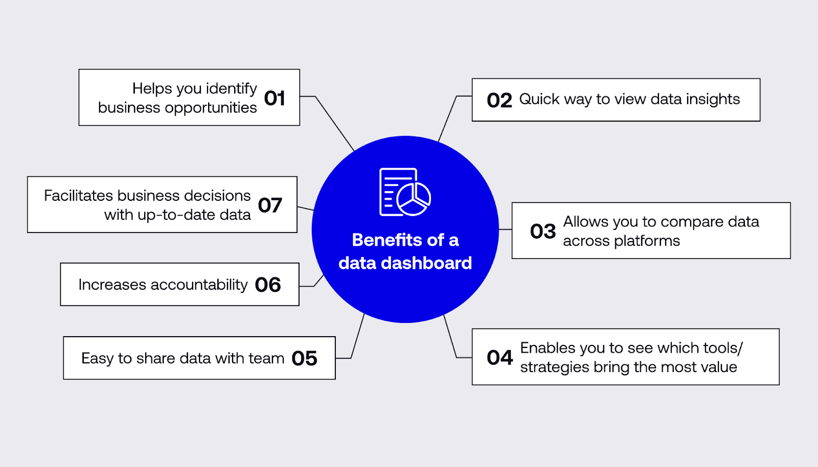
An intuitive data dashboard not only gives you quick insights into your core metrics but also enables you to combine information from different platforms and share it with your team.
But if your data doesn’t stay up to date, you’ll be working off outdated information — and this can affect your bottom line.
85% of data leaders admit that their companies have lost money by making business decisions using old data.
With a data dashboard that updates in real time, your whole team can make well-informed decisions based on how you’re performing right now.
Here’s a guide to show you how to create a data dashboard with no coding that updates automatically.
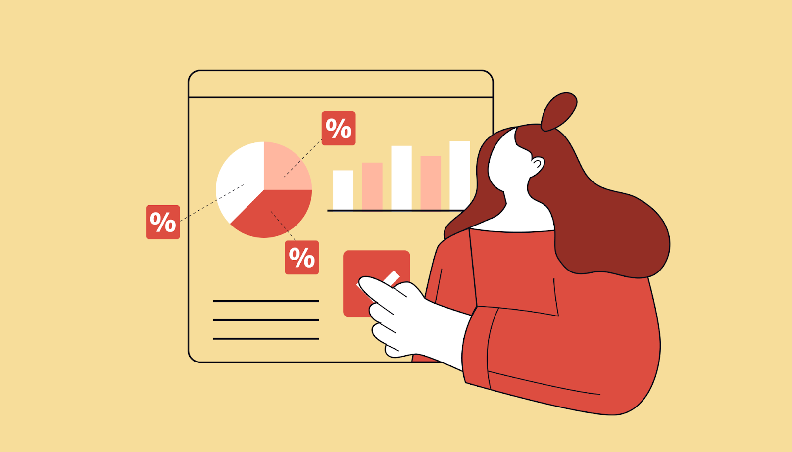
What’s a data dashboard?
A data dashboard is a tool that provides visualizations of data — graphs, charts, funnels, etc. — on one screen so that you can interpret the information easily. Whereas data reports give you a deep dive, a data dashboard is designed to facilitate a quick overview in an easy-to-read format.
Data dashboard visualization helps you answer questions about your key performance indicators (KPIs), enabling you to test hypotheses, set targets, and measure progress.
Your data dashboard should be interactive, allowing you to change the visual appearance and parameters of that information (such as the time period).
A data dashboard also makes it easy to compare data from different platforms by creating clear visualizations that can be viewed side-by-side.
However, a problem with many data integration and visualization tools is that you need coding skills to create a comprehensive, tailored overview. This is especially true if you’re using a free data dashboard.
83% of data leaders complain that, because of their existing processes’ complexity, they’d need a lot more highly trained staff to manage their data in this way. A major concern is that training them would cost too much time and money.
That’s why 40% of companies are making a concerted effort to implement easy-to-use data tools like Plus.
With Plus, you simply take a Snapshot of the data you want and add it to your dashboard — with no coding needed. The information stays up to date, making it easy to recognize patterns in your data and compare metrics across multiple apps.
While there are plenty of existing data visualization and data dashboard products, none are quite as simple as Plus’ Snapshot tool.
What are the benefits of a data dashboard with real-time updates?
It’s no good having a data dashboard that lags. If you can’t see data trends in real time, you’ll base your business decisions on old news.
Here’s what you can do with a data dashboard that updates immediately:
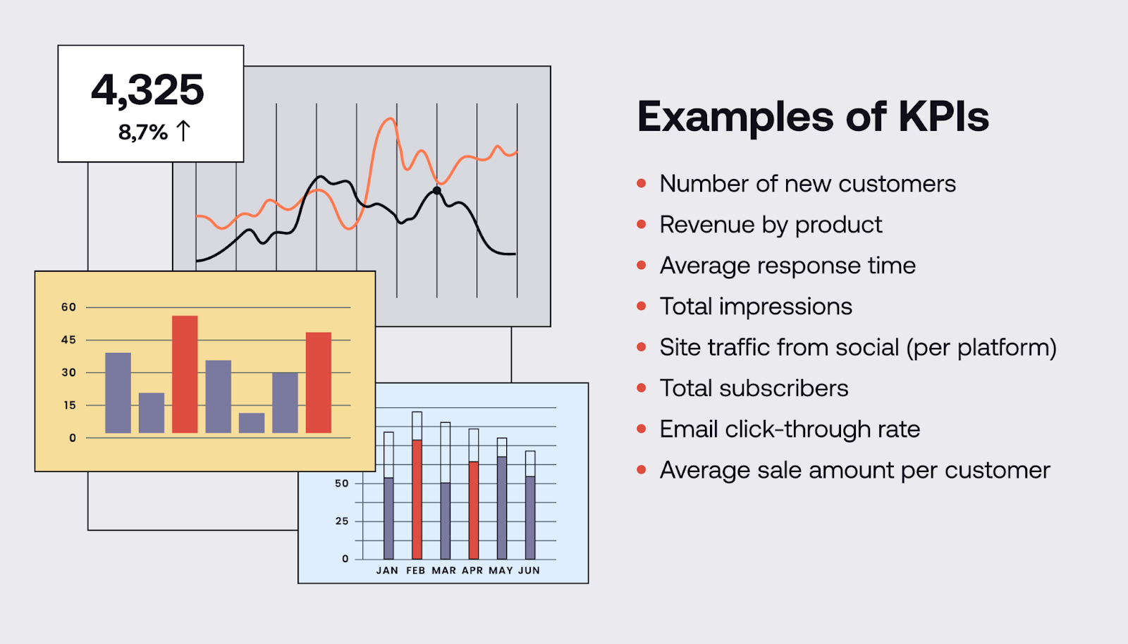
1. Visualize KPIs easily
Your dashboard for data visualization will provide you with a quick overview of your data in real time.
Spreadsheets and analytical tools often overwhelm their users. In contrast, a good data dashboard makes data visualization straightforward by allowing you to organize your information into easy-to-digest visual graphics, like charts, maps, and tables.
By presenting data in a way that’s easy to visualize, a data dashboard helps you answer questions about your KPIs more quickly.
For example, imagine you’re trying to improve your sales. You need to know not only if you’re getting more sales but also if you’re making more profit per customer, which products are your bestsellers, and where you’re generating the most revenue from.
With a data dashboard that produces easy-to-read charts and funnels, you can visualize your sales progress in one place rather than having to decipher meaning from long lists of sales figures across different screens.
2. Access correct data in real time
One of the biggest problems in organizations is that teams share and use outdated information — often without even realizing it. In fact, 66% of data leaders claim that their C-Suite wouldn’t even know if they were making decisions based on old data.
When teams forget to update spreadsheets or make changes to reports, companies lose time and money pursuing ineffective strategies based on information that’s no longer relevant.
The problem here is that most companies can’t access real-time data quickly.
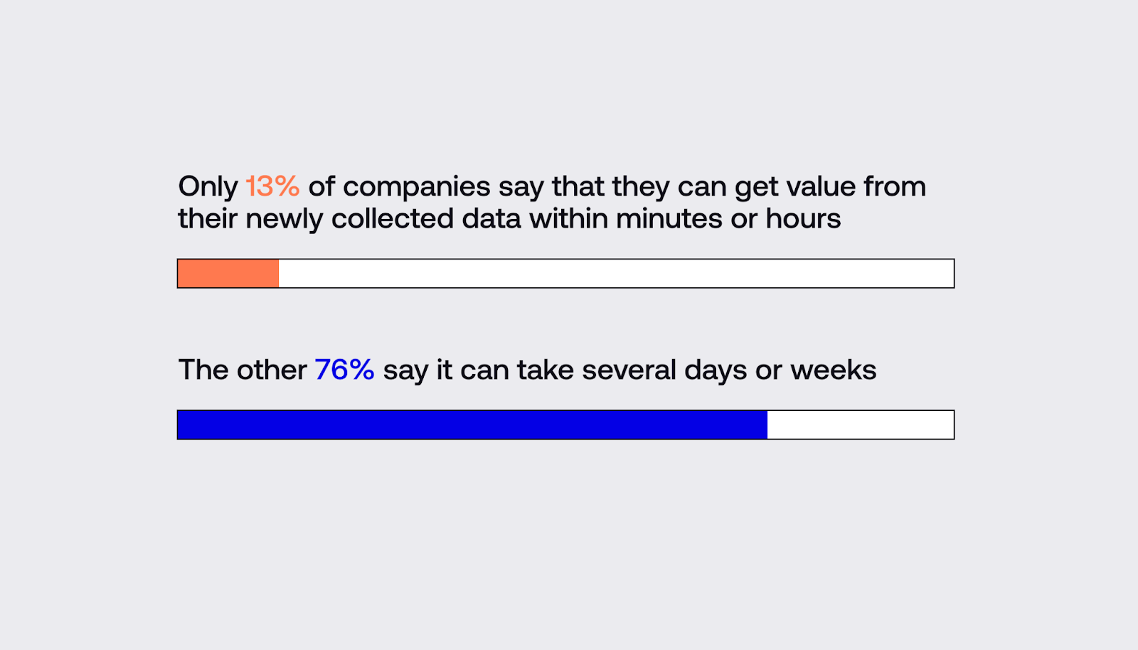
Right now, only 13% of companies say they can get value from their newly collected data in minutes, whereas 86% say it can take several days or weeks.
With a data dashboard like Plus, not only does the information in your dashboard update in real time but also any Snapshots that have been shared with your team or embedded in reports. That way, everyone views the most up-to-date information when making business decisions.
3. Share up-to-date information quickly
Data dashboards make it easier to share information.
Teams have one location where all data is available as a centralized source of truth.
If you want to share that data, setting up a data library or dashboard in a tool like Plus simplifies the process.
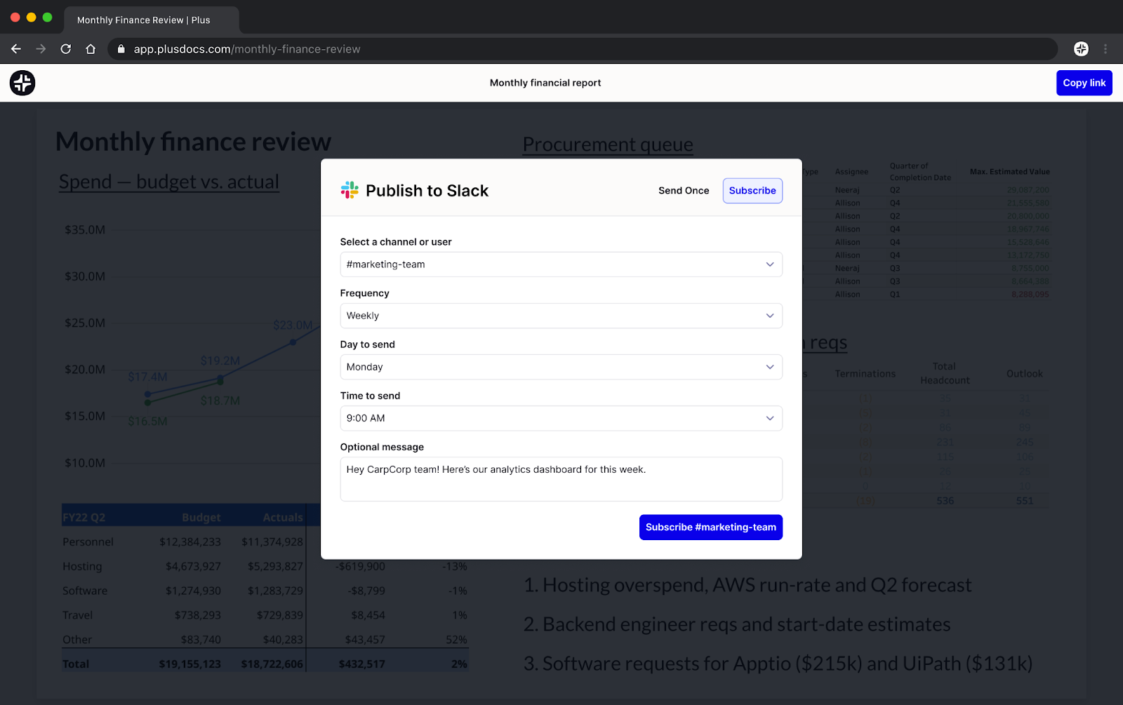
Simply take a Snapshot of the information and send it to colleagues via email or Slack, or embed it in a website or presentation. Plus makes sure that all of your Snapshots automatically stay up to date.
4. Automate data management
81% of businesses say they want to automate more of their data management to free up time for their teams to focus on more strategic activities.
A data dashboard is an ideal tool to help with this, as it will automatically manage your incoming data and present it in an easy-to-read format.
If you’re still doing this manually, you’re wasting not only time and money but also your team’s capacity. Instead of mindlessly sorting data, your team could tackle more complex problems while your dashboard processes and presents data automatically.
5. Make better business decisions
When you have to flip between tools and platforms to work out how your business is functioning, it’s easy to miss something.
A data dashboard lets you compare information from all your platforms in one place. That way, you can get a clearer overview of your company’s latest performance.
This makes it quicker and easier to make more valuable business decisions and identify future opportunities.
How to set up a no-code data dashboard that updates in real time
With Plus, you can set up a dashboard to see all of your relevant information on one screen and share it with your team.
Here’s how to set up a no-code dashboard step-by-step:
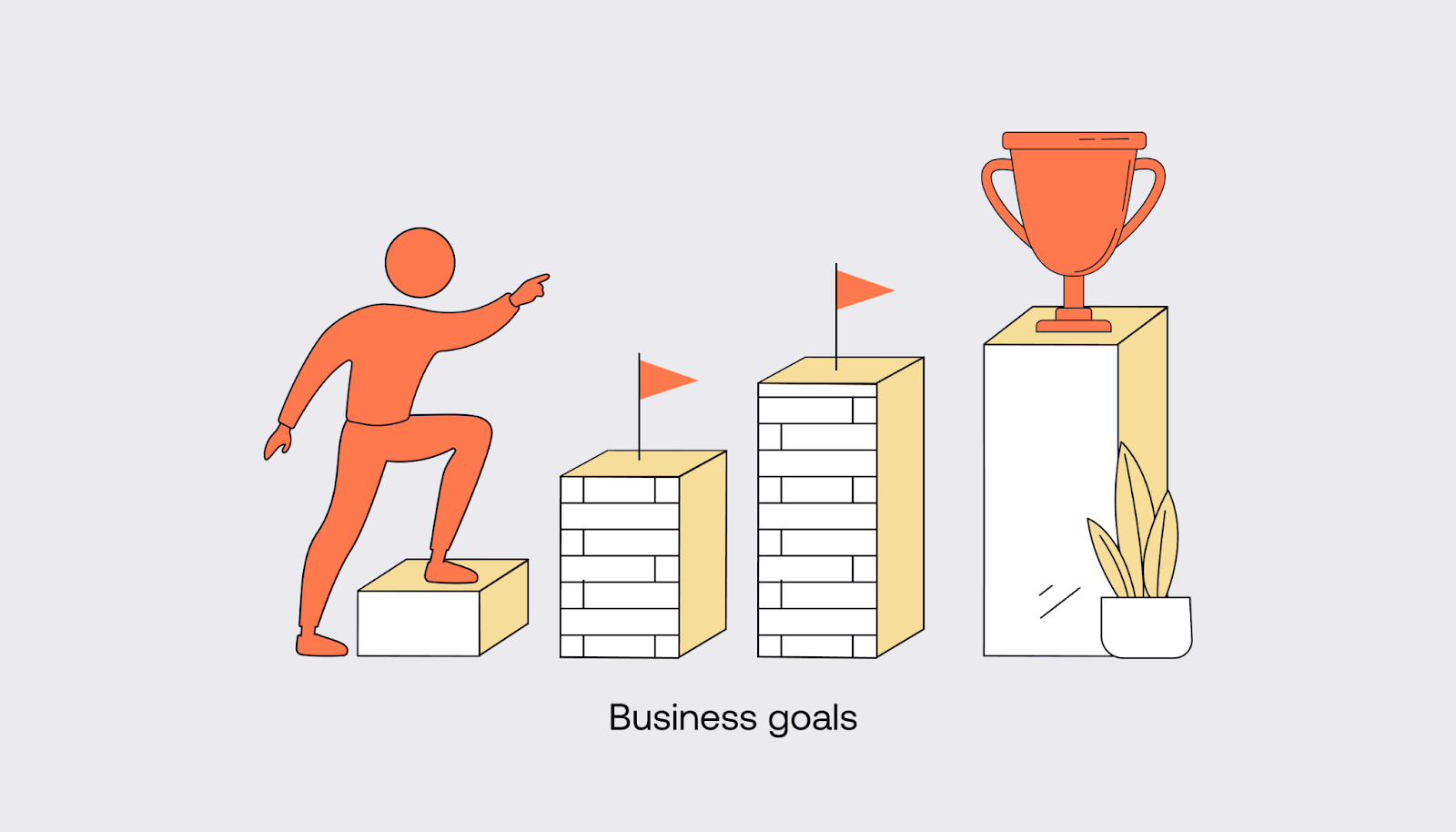
1. List goals for your business
Your dashboard shows you the progress you’re making toward your goals. If you’re not clear on your goals, you won’t know which information to include on your dashboard.
The first step to creating a useful dashboard is to decide on the targets you’re aiming for, so you can pinpoint the KPIs you need to measure your progress.
For example, you may be aiming to:
- Increase sales
- Boost website traffic
- Expand awareness
- Reduce churn
- Diversify your customer base
2. Evaluate bottlenecks that are preventing you from reaching those goals
What’s currently standing in the way of you hitting your targets?
To achieve your goals, you not only need strategies to reach your targets but also tactics to overcome hurdles.
To work out whether you’re breaking down your barriers effectively, you need to measure their resistance and compare the impact of this on your progress.
Get together with your team to identify the barriers that stand in the way of reaching your goals.
Bottlenecks might include the following:
- You’re unsure which sales channel is the best, so you’re trying to sell on all of them — spreading your resources too thin as a result
- You’re not clear on your target demographic, so you don’t know who to market to
- Your customer journey is overly complex and time-consuming, so customers drop out before conversion
On your dashboard, you should add KPIs that measure the bottlenecks to define the problem. That way, you can design better strategies to overcome the issues.
For example, if you’re using too many different sales platforms and are unsure which is most valuable, you’ll need to measure each one’s profitability. KPIs may include the number of conversions from each sales channel, the value of conversions from each sales channel, and the number of repeat customers.
3. Identify KPIs related to these goals and bottlenecks
Once you know the goals you’re trying to reach and the barriers preventing you from reaching them, you can identify the best KPIs to measure your progress.
With the right KPIs, you can see where you’re performing well and where your bottlenecks are getting the better of you. This will help you design more effective strategies.
Make sure you think laterally. If you want to increase sales, don’t just measure the number of conversions.
Look at KPIs such as:
- Which products sell best
- Which channels generate the most sales
- The demographics of your ideal buyer
- The point at which buyers drop out of the customer journey
4. Find tools that measure these key metrics
A data dashboard won’t measure these indicators for you. It will simply present your data in an easy-to-digest format.
You’ll need to find tools to measure your KPIs, and you may need to use several different tools for different metrics.
Think about the goals you’re trying to achieve and what information you need to measure your progress. Find tools that measure associated behaviors.
For example, if you’re trying to increase awareness of your brand, you may want to look at social media reach, website behavior, and email subscriptions.
In this sense, you’d need to take data from each of the following tools:
- For insights into social media behavior, look at the analytics dashboard available on your social media accounts
- For data on website behavior, use Google Analytics
- For information about your email click-through rate, use the analytics section of your email marketing software
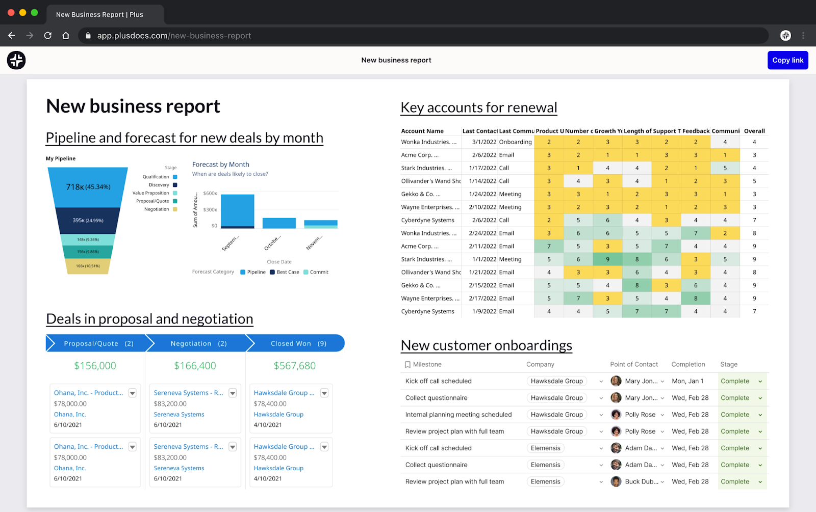
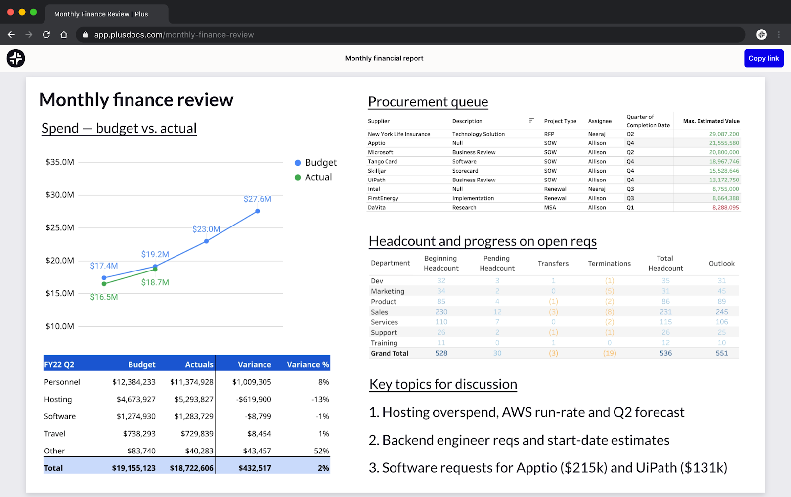
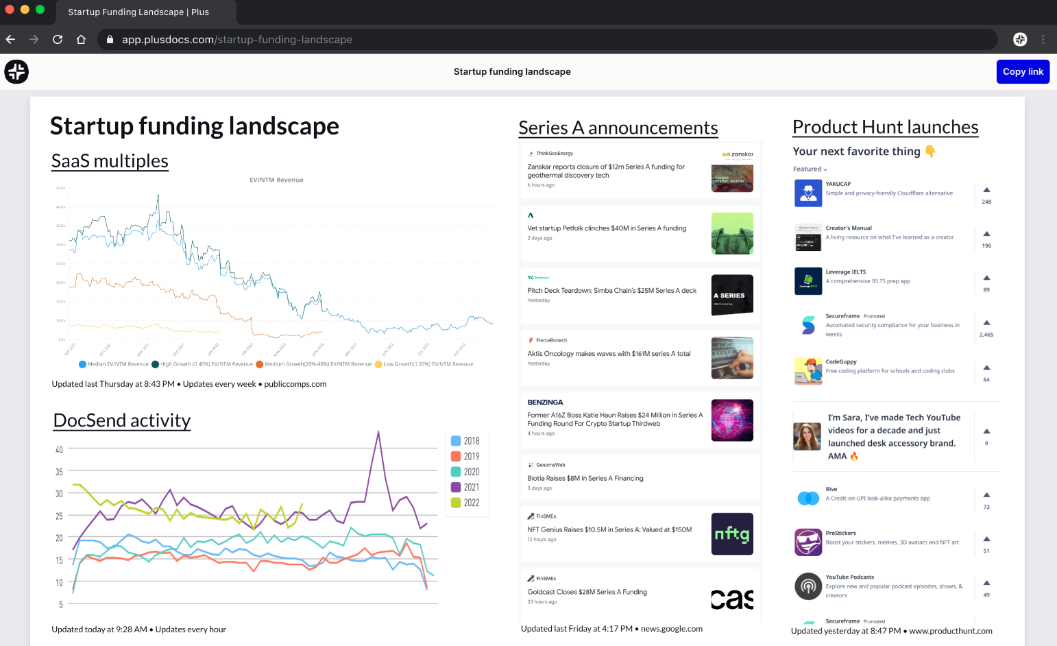
5. Create a Plus dashboard
Plus enables you to take Snapshots of your analytics platforms and combine this data on shareable dashboards.
Once you’ve created a Plus account, you can take Snapshot and set up dashboards related to your business goals.
For instance, maybe you’re interested in a financial dashboard to view monthly profit and loss. Perhaps you want an overview of your sales. Or maybe you want to visualize audience growth. With Plus, you can create a dashboard for each of these goals and flip between them easily.
Plus lets you update your dashboard on a schedule that works for you. You might need some data to update once daily, and other data to refresh every 15 minutes. It’s easy to set your schedule and change it as you need to.
You can also refresh snapshots manually at any time with the click of a button.
Unlike other data integration solutions, Plus is a no-code dashboard tool, and you can set up your first dashboard in a matter of minutes.
Businesses are currently overpaying heavily for data integration solutions (by around half a million dollars a year, on average) because they rely on building these systems manually.
Plus makes it easy to create a real-time, shareable dashboard with a few simple Snapshots, and it doesn’t require any training.
6. Share the dashboard with your team
For 36% of teams, a data visualization tool that can easily communicate data insights is a top priority.
This is because it puts everyone on the same page. There’s no longer confusion about where to find the most up-to-date information — everyone heads to the same dashboard.
You can improve your team’s accountability and responsibility, and having accurate, up-to-date data will help your team make better business decisions.
Once you've set up your Plus dashboard, share it with your team so that everyone has a go-to place to view the company’s most important data.
7. Embed Snapshots in the tools you use every day
Not only can you create a Plus dashboard with your Plus snapshots, you can also embed Snapshots directly into apps like Google Slides, Slack, and Coda.
These Snapshots automatically update based on the schedule you’ve set. You can also refresh them manually by clicking the “Refresh” button.
By embedding snapshots in tools like Coda and Google Slides, you can create reports and presentations that stay up to date and make it easy for your team to see its most important data without hopping between tools.
Conclusion
The best dashboards allow your team to see all relevant data in one place, share it easily, and keep it up to date automatically.
Plus lets you create flexible, intuitive dashboards and share information across different apps and platforms. As a result, your team can get up-to-date data wherever they’d like to see it.