Creating great presentations can be a daunting job — you can’t just be a good writer, you also need to make visually-pleasing slides. Designing a presentation involves hundreds of design decisions — like structuring the content, laying it out on a page (should you use columns? rows? bullets?), choosing typefaces (there are so many fonts!) and font styles, to selecting colors and adding graphics.
Unless you’re a professional slide designer, you’ve probably wasted hours struggling with these decisions.
If you want to make visually appealing, cool-looking, or aesthetic Google Slides but don’t know where to start, then this guide is for you.
{toc}
Always start with content, not visual design.
Before we get into it, let’s start with the cardinal rule of presentation-making.
The single biggest mistake we see all the time is people who try to “design” slides before having a clear idea of what they want the presentation to say. You should align visual design to content structure, not the other way around.
We strongly recommend that you start by mapping out your content. Start with an outline that will force you to clarify the goals and shape of your presentation and hone in on your key messages. Don’t worry about writing all of the copy on the page yet, but try to get to a list of slide titles and the key points you want to make.
Try to answer the following questions:
- Who’s the audience? (What should be the voice and tone?)
- What are the three key takeaways for the presentation?
- Are people going to be reading the slides or is someone going to be talking over it? (How dense should the slide content be? How many slides do you need?)
- Will it be projected on a screen or will people look at it on their phones (in which case you might want to use a vertical layout)?
You don’t have to design slides from scratch.
Staring at a blank presentation can be daunting and paralyzing — after all, you have to figure out both your content structure and design your slides. Here are some alternatives to getting started.
Use a template
The easiest way to make beautiful Google Slides is to use a premade template. Instead of trying to master slide design yourself, leverage the work that other designers have already put in.
How should you choose a template? You can choose a template either based on the presentation content you need or based on its visual design. If you already have a content structure in mind (because you followed the first step of this guide!), then you can actually choose from a wider set of presentation templates. Just look for the visual style and content layouts that fit your need.
.png)
Check out the Plus template library for Google Slides — they’re totally free to use.
Use an AI presentation maker
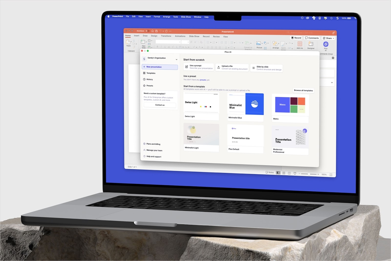
Plus AI is one of the best AI presentation makers. It gives you the best of both worlds of starting from scratch and from a template. Plus can generate an outline for you from any prompt, so you don’t need to stare at a blank sheet of paper (or screen) or be constrained by the exact structure in an off the shelf template.
The slides that Plus AI generates are clean and professional, including a wide variety of slide layouts that you can further customize and tweak. You can also apply custom themes to customize the look and feel even further.
%20end%20to%20end%20prompt%20to%20presentation%20demo%201.gif)
{cta}
6 design rules for making visually appealing slides
Even if you use a template or a tool like Plus AI, it is still useful to understand the principles of slide design, so you have more freedom to edit and play with your content structure. You don’t need to become a typography expert or master color theory, just follow these basic principles to quickly up-level your slide designs.
1. Page layout is your first priority
It doesn’t matter how aesthetic your color palette is or how harmonious your typeface choices are, if content is not well laid out on your page.
- Check your slide margins and spacing across your slides.
- Zoom out and look at them in a grid view, which will help you spot issues.
- If you have repeating elements on a page (e.g., 3 columns of text), make sure they are aligned and evenly spaced. Use an imaginary grid to layout your content.
.png)
2. Establish clear information hierarchy
In general, don’t use more than 2-3 font sizes on a page. A reader should be able to quickly glance at your slide and understand which text elements are titles, headings, and detail. The more text sizes you have on the page, the more muddled your content structure becomes.
If you’re struggling with this rule, you probably have too much content on your slide. Try splitting it up into two or more slides.
Make sure your titles and headings are visually distinct from your body text. You can accomplish this by varying text size, weight (e.g., boldness), typeface (font), color, and positioning.
%20(1).png)
3. Keep everything consistent across slides!
Make sure your slide title looks exactly the same and is located in the same place across your slides. Don’t vary text styles or sizes across slides. Use a consistent and coherent color palette. If you have graphic elements, make sure they are in the same style across the presentation.
You can make exceptions to this rule, but make sure you do so intentionally, like inserting a full bleed quote slide to emphasize a point.
These are the first three rules because they are all you need to make a visually pleasing presentation. Once you’ve mastered these, you can play with your slide designs to introduce more visual interest — to make them look “cool,” or “aesthetic.”
4. Establish an intentional, but limited, color palette
Using color is the easiest way to evoke a mood or tone.
We recommend picking one, two, or three primary colors for your presentation, then building out a color palette around that. Always test your palette to make sure there is enough contrast between your background and text colors, so that your content remains legible! (As a general rule of thumb, keeping your background and primary text colors neutral can help.)
%20(1).png)
You can get inspiration anywhere. Use a color picker to extract colors from a photograph that represents a feeling or vibe you like. Adapt the colors from your favorite brands and websites.
.png)
By the way, you can use Plus AI to generate custom color palettes for you. You can import themes from Plus templates or use tools like Coolors.co to generate color palettes quickly.
%20(1).png)
{cta}
5. Typography is a vibe
Like colors, your choices of font (and font styles) do a lot of heavy lifting when it comes to conveying your message. It is the most immediate way to convey a tone. Is this a serious or playful presentation? Is the vibe luxurious and refined or cool and cutting edge?
%20(1).png)
We recommend selecting one or two fonts for your presentation. For professional, business, or minimalist presentations, just go with one (just make sure it looks good at all sizes). If you want to add more visual interest, try choosing a pair of contrasting fonts.
Tips for choosing fonts in Google Slides:
- Use the Google Fonts site to preview some text. Try them out at different sizes and weights.
- In Google Slides, the default set of font choices is pretty limited. You can add more by clicking More fonts inside the font dropdown.
- Note that unfortunately you cannot use custom fonts (i.e., non Google fonts) in Google Slides. This means that if your company or brand uses a specific font, you’ll need to find something similar in Google Slides.
Need a place to start? Here are some of our favorite font pairings:
- Roboto & Bitter
- DM Sans & Sanchez
- Sync & Plus Jakarta Sans
- Fraunces & Source Sans Pro
- Libre Bodoni & Inter
- Hepta Slab & Space Grotesk
.png)
6. Add graphic elements but don’t overdo it
Obviously, adding graphic elements like illustrations, icons, photos, or abstract shapes can make a big impact on your presentation. We love using imagery in our designs.
In general, the more image-heavy your presentation is, the simpler you should keep your other design elements (fonts, colors, content density).
%20(1).png)
Tips for adding images to your presentation:
- Ideally, the photos should have some relevance to your presentation.
- Visual consistency. Make sure the photos and your presentation color palette are harmonious. If possible, make sure photos are in a consistent visual style across the presentation and especially on the same slide.
- There unfortunately aren’t many built-in photo editing tools within Google Slides, but you can often get a lot of mileage out of just adjusting the brightness and opacity of images to make them more cohesive.
- Mask your images in a shape (like a rounded rectangle or circle) to mirror other slide design elements on the page and create focus.
- Btw, Google Slides doesn’t support SVG import. Here’s a workaround for that.
.png)
Beyond photos and illustrations
%20(1).png)
Try adding a gradient background instead of (or in addition to) using photos. It’s a simple but powerful way to create something more eye-catching.
Instead of building or hunting down complex infographics, try playing around with native shapes within Google Slides. You can accomplish a lot with simple geometric shapes.
Free resources
Here are some of our favorite free design resources. Make sure you check the license and usage rules and give credit to designers when needed.
- Photos: unsplash.com, pexels.com
- Icons: thenounproject, Figma community (search for icons)
- Fonts: Google Fonts, How to pair fonts
- Gradient backgrounds and more: magicpattern.design
- Colors: coolors, colorhunt.co
- Inspiration: awwwards.com, siteinspire.com, dribbble